Category Archives: Human Interface

Some of What I’ve Been Up to Lately…

Back in 2010, I made the decision to restart the user experience consultancy portion of Human Computing (www.humancomputing.com). As such, I stepped back from my role running the ComicBase portion of the business, and have been focused on designing new products for some very cool clients in the enterprise, mobile, and consumer electronics spaces.


One of our largest clients this past year has been TiVo, the folks who brought us both the DVR and the ridiculously cute corporate trademark.

I’ve just completed a long contract there, which–among other challenges–saw me helping design their next generation of high-end DVRs and streaming video boxes. This was a terrific project which I was lucky enough to see through end-to-end. On it, I got to do everything from sawing apart old circuit boards and visiting Radio Shack in the middle of the night to assemble testing prototypes… to doing screen design… setting up user studies… and even working with an exceptionally clever engineer to figure out how to get the box installed (and the cable guy back on his way) in a third of the time it used to require.

Best of all, I got to meet and work with some amazingly smart folks both on the user experience team and throughout the company. I may even sign on more adventures there next year, but for now I’m very happy to be back in my robot-strewn office at Human Computing helping put the final touches on the much-anticipated (and slightly overdue) ComicBase 16–and looking forward to a terrific Christmas with my family.

Hey! We Made That!

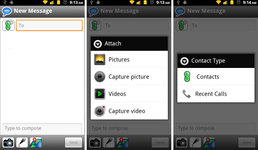
Almost a year ago, I got brought in to help design the new Verizon VCast Messaging client for Android. Now at last, the finished product is finally out in the world (and out of non-disclosure!)

Much like a movie, the final cut of the product morphed a little from the original design, but the fundamentals seem to have made it to the marketplace intact. Kudos to our visual designer, Mark Castaneda.

Engadget even linked to this rather nice preview (from Droid Life):

http://www.droid-life.com/2011/01/13/verizon-enters-the-text-app-arena-with-v-cast-messages/

Evan Doll on the iPad (via uxtalk)

I’ve started a separate blog focusing on user interface and design issues (uxtalk.wordpress.com), but I wanted to note a recent posting about designing for the iPad, courtesy of fellow Apple alum Evan Doll who now teaches a course over at Stanford on usability.

Noted tech visionary Alan Kay also seems interested in the iPad, judging from his recent comments.

The Apple iPad: Why a “Fourth Device” Makes a Lot of Sense

At CES, the buzz was on 3D, but  my money is that the new consumer device most bought this year isn’t shutter glasses and a new 120-240Hz TV, it’ll be an e-Reader of some sort–and most likely one with a picture of a piece of fruit on the back.

Apple, of course, just announced their long-awaited (and unfortunately named) iPad. Starting at $499, it’s a very slick piece of technology, although the gadget press overall seemed muted in their enthusiasm. Most of the critical comments centered on it being a “fourth device” (the others being a desktop, laptop, and app-phone) which doesn’t really replace anything. While I’m sympathetic to the complaint about lugging yet another device around, I’d argue that for its intended audience it very well may replace something: books. And for many other people, at many times, it may also replace the laptop and television as ways of consuming entertainment on the go.

What we’re seeing in the iPad is a new being: the media consumption device with a few capabilities to process and mark up media on the go. Unlike say, a laptop, it’s not equally capable of both authoring and consuming media; it’s fair to poor at the former, and outstanding at the latter. But luckily for Apple, most folks, most of the time, are media consumers.

Given the right ecosystem of content delivery, the iPad (and its successors) could prove as indispensable to people on the go as the tattered Dean Koontz paperback in their overnight bag. What’s more, it has the potential to replace stacks of textbooks or (more immediately in my case) the need to carry around several hundred pages of product specifications and technical notes as part of a work project. It also has the potential to prove an amazing device for browsing the web–probably the most-favored (and little-recognized) time-killer next to watching television.

Lastly, the iPad is already changing the eBook game, bringing full color and snappy screen response as well as the ability to read all the books from both the Amazon Kindle and Barnes & Noble libraries (assuming Apple keeps to their promise that anything that runs on the iPhone will run on the iPad).

In the end, I think the iPad will succeed and find a way to become that fourth device in people’s book bags. In all likelihood, it’ll just replace a few of the books in order to make room for itself.

From the Department of Unintended Design Consequences

It’s no secret that I love the idea of LED lighting, and hate the idea that so much energy from a conventional incandescent bulb is wasted in the form of heat. It turns out, though, that colder climes are discovering that there’s a lethal downside to electrical efficiency when it comes to traffic lights:


http://gizmodo.com/5428749/energy+efficient-led-traffic-lights-are-backfiring-in-a-deadly-way

The problem is obvious in retrospect, but I for one sure didn’t think of it ahead of time. I suspect there’s one of those annoying, “try it small before rolling out across an entire city” lessons we should be taking away from this one, as any fix is likely to be hugely expensive.

Human Computing Gets a Phone System Upgrade

Please share in our joy at putting a stake through the heart of our old telephone system at the office–or at least the telephone answering/routing portion of it. (Note to AT&T: Your 974 is a fine office phone, but the 984 answering system at the heart of it—to quote Jean-Louis Gassée– “…could be even better.” I’ll spare you the translation of what that implies it is currently).

In any case, the direct phone numbers to reach us all on are:

Wish us luck as we settle into the new phone system, and please let us know if you have any difficulty with any part of it.

Progress Bars for Stop Lights

Designer: Damjan Stanković

from Yanko Design–a brilliant concept.

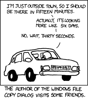
The designers offer a rationale that seeing exactly how long you need to wait for a light will let you know whether it’s worth it to switch off your electric car, but this strikes me as a bit grasping. The real worth behind the concept is the same for progress bars everywhere–they’re tremendously reassuring indicators that the wait is progressing steadily toward an end, and which let you adjust your own expectations immediately toward the perceived completion time. (Thwarting this is what makes Microsoft’s Copy progress bars so frustrating).

(From XKCD)

In a study I did at Apple years ago, we subjected users to an unexplained delay in the computer’s processing after they hit a “Save” button while doing data entry. Half the users actually concluded that the computer had crashed (getting up from their seats for help or pressing the Reset button) when it didn’t respond in 8.5 seconds. Displaying a watch cursor bought several more seconds, and an animated watch worked even better. But a progress bar* had the users more-or-less-happily waiting for several minutes–exactly the effect you’d need to calm tensions in a cross-town commute.

*A standard (not indefinite) progress bar–we didn’t test indefinite progress bars in this study.

As enthusiastic as I am about the concept,  then there’s the part where reality intrudes: The LED technology behind current stop lights makes this physically possible, but although the circuitry needn’t be expensive to make it work, the labor and construction costs involved with replacing or retrofitting existing stop lights–quite possibly running nearly six figures per light(!)–make any sort of broad-based switch-over extremely unlikely in the foreseeable future.

Less to Look At=More Attention to What’s Left…Or Less?

We’re going through yet another web redesign on Atomic Avenue’s home page, and I find myself cutting out a lot of visual elements we’d tried, but which don’t seem to have been pulling their weight.

Many of the calls were easy ones to make, but I’m finding myself with a question about the underlying cognitive aspects of minimalism:

Does eliminating “noise” content (e.g graphics or ads not relevant to a particular user) always help give what’s left more emphasis…or is there a point where a presentation becomes uninteresting because of the lack of noise?

In general, I’d guess (and I am only guessing) that most web designs tend to include far too many items and appeals for attention, and to the extent that they’re irrelevant, they ultimately take away from user’s ability to focus on what they do care about. If so, it should be possible to measure the effect, as well as its impact on sales.

That said, I can at least imagine a situation where the various bright, blinky parts of a web site are providing a certain baseline of mental excitement—without which, the site may be seen as boring or uninteresting (and thus, less successful).

Browsing through mall retail stores, it seems that most go with the “at least some background noise” strategy, often literally in the form of piped-in music on the store’s sound system. Assuming it’s not just a way to keep bored staffers awake, it would seem to be an appeal to the shopper’s overall energy level and mood, as well as to help “brand” the store (e.g. the Goth music at the local Hot Topic).

At the same time, Apple Stores and certain high end boutiques can be spare to the point of austerity in their presentation. These stores stand out even more as sanctuaries from the constant buzz and bombast of the surrounding venues, and I do find myself paying closer attention (at least I think I do) to the merchandise on display as a result. But I’ll admit I know of no real research on point, and my feeble attempts at Googling some up have been for naught.

Any ideas of your own here?

Interface Band-Aids

A good human interface designer can usually work out a workable solution to an interface problem in short order once the problem becomes visible. The problem is usually spotting the problem in the first place.

User testing’s real benefit is spotting problems that the designers overlooked. Another way to get feedback on how well your human interface is working is to be the one who answers the tech support email. In this sort of small-shop scenario, an interface designer who wants to stay sane has a powerful motive to fix badly designed features–fast!

Every once in a while, however, a problem comes along which defies any sort of elegant solution. The underlying cause is usually conflicting design goals, or even a split in the way different groups of users view or use the system. More rarely, there’s a very lovely and elegant solution that’s possible, but for technical reasons, it can’t be implemented. Rare on desktop applications, I’ve come across this latter problem all too often in web design.

Take the following, very simple dialog as an example (and for now, I’ll break the cardinal rule of Interface Guru-dom and actually criticize a real product that I had a hand in designing: in this case, the web-based ComicBase registration screen):

On one hand, I quite like the sheer minimalism here, and if you can momentarily forgive that the “Save” button would be better labelled “Register”, at first it seems like a nice little screen.

The fatal quirk comes as a result the peculiarities of the registration system. ComicBase FREE doesn’t require (or have) a serial number; other versions of ComicBase do. The system figures out which product you’re registering using the serial # you’ve entered. In some cases, the user will have to select between a few related versions of ComicBase using the drop-down, but usually the drop-down’s list can be populated with the one or two choices that apply. As such, the user’s path through this screen is:

1. Enter a serial # (or select ComicBase FREE)

2. If a serial # was entered, click the “Check” button to validate the number (and populate the product drop-down with the list of possible products).

3. Choose which of the possible products you are registering

4. Click Save

It sounds reasonably simple, but you may have noticed that there’s a rather interesting set of dependencies and modalities implicit in all this—none of which are communicated to the user.

If the product being registered is the FREE version, the user is meant to ignore the Serial # field altogether and just click Save. While that’s a bit inelegant, the real problem that users reported on the tech support lines was that, “I can’t register my program, because I have ComicBase <x> and the only option is the FREE version!”

The culprit is the “Check” button (indeed the very need for it). The Check button is there to cut down a very long list of possible products—many of which have very similar-sounding names—to just the list of valid products for that serial number. At the same time, it ensures that the user isn’t entering invalid or garbage data. While it’s performing a very important function, however, many users never think to press it, so the drop-down list is left showing just ComicBase FREE.

And they call tech support (bad) or just give up and don’t register (worse).

What’s the solution? It’s hard to say. There are any number of possible redesigns that solve all the process problems by making the dialog much larger, breaking the process into multiple steps, and so on—all of which can be worse than the original problem.

What breaks my heart as a designer is that there’s a fairly effective and reasonably elegant solution that gets used all the time on the desktop, but which is hard to implement in a multiple browser-supported way on the web: simply get rid of the Check button and do all your checking in real time as the user types (or when they exit the field).

If we could do this, then—like magic—the list would always have valid data in it. If we could further control the Save (err… I mean “Register”) button to be dimmed once the user started typing a serial number, but enabled it again once they finished typing a valid one, we’d have the whole thing worked out. As a bonus, we’d have lost an interface element in the process, adding to the overall flow of the already minimalistic design.

Perhaps at some point, I’ll get clever enough to work out an implementable solution like that. In the meanwhile, however, I’ve been forced to use the Mark of Shame for interface designers: Help Text:

(As a nod to interactivity, the help text disappears when the user enters a valid serial number and clicks Check (an “OK” appears next to the Check button to indicate that the serial # is valid and the product list visibly changes).

The redesign hasn’t been user-tested yet, but I’d be willing to wager that it largely—if inelegantly—solves this particular problem. Even so, this particular interface bug won’t really drop itself from my mental “to do” list. Guideline to all interface designers: whenever you solve an interface problem by adding instructions, you haven’t really solved the problem.

Using help text to paper over an interface problem like this is like the folks who tape red cellophane over their tail lights after a fender bender so that their brake lights once again appear red. Yes, this sort of Band-Aid approach handles the most urgent problem and prevents disaster, but you’re not really fooling anyone. Unless you’re planning on ditching the car (or program) soon, you’re going to have to eventually scrape enough resources together to solve the problem properly.