Standard disclaimer: This is one of those “how to overcome an incredibly geeky tech problem which has been bedeviling me forever” posts. It’s meant as a virtual breadcrumb for anyone who faces a similar issue. If you find it and it helps, please give it a “like”. If this isn’t the sort of thing that interests you, by all means skip on to the next comic, music, or pop culture-related post.
Anyone who’s ever done Windows Forms coding knows what a pain in the nether regions it’s been to get windows and type to properly handle monitors with different resolutions. (I wrote about it years ago here)
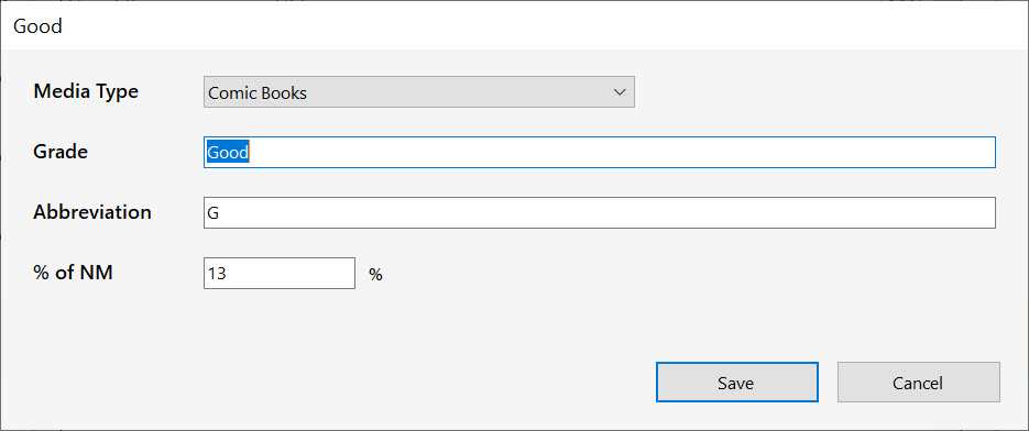
Things got substantially better with the introduction of .Net Framework 4.7.2, which started to make it possible to properly scale things when you had multiple monitors with different resolutions. Still, there were certain actions–such as dragging a screen from a hi-res 4K monitor set to 150% magnification to a regular monitor set at 100%, that would give results like this:

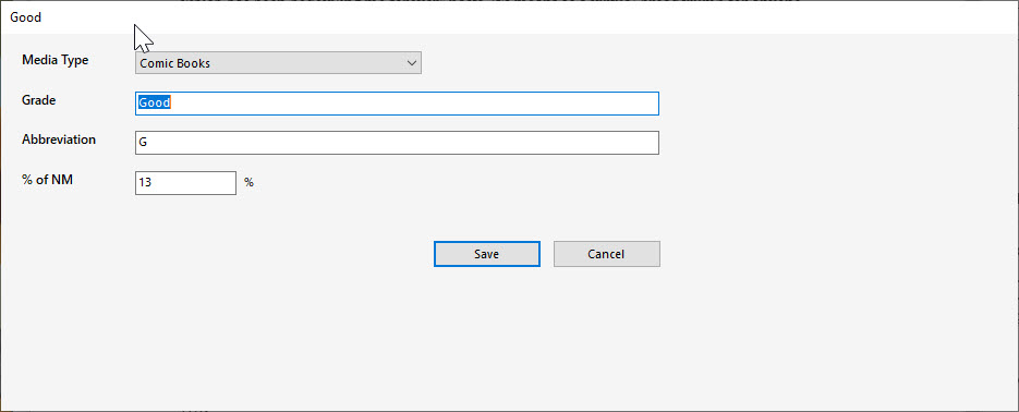
…becoming this

…when dragged to the adjacent 1080p monitor, whose display scaling was set to 100%. Note the sea of white space at the right and bottom. This occurs even when there is no program code to setup the window.
Worse, when dragging the window back to the original monitor, the white space remains–or even grows (in some cases, enough so that repeatedly dragging the window back and forth fills the entire screen).
Granted, it’s possible to manually compute your own window scaling factors, and resize and scale every element as necessary whenever the form was moved, but this is beyond tedious in practice–and it makes dragging forms around both slow and ugly to boot. You also need to test that you’ve handle any screen DPI switches that happen simply when the user switches up their display settings in the control panel–another can of worms.
Setting both monitors to the same scaling factor removes the problem, but that’s also not really a solution.
So what is the solution? It turns out it’s two things: one of which makes sense, the other which appears to be a bug in .Net’s rendering algorithm.
- The default setting of any Windows form’s “AutoSizeMode” property is “GrowOnly”. This needs to be overridden on every form to be “GrowAndShrink”.
- The culprit behind the growing white space, however, was the anchor property of the bottom buttons(!). One might reasonably assume that since the action buttons are meant to be placed dependent on the position of the lower-right of the window, that anchoring them to the bottom-right of the form makes sense. (This is exactly what you’d do if the window was capable of resizing: you’d always want the buttons to ride at the bottom-right of the form).
The bug apparently comes, however, in that setting the buttons to be anchored to the bottom right of the form messes up .Net’s calculation of how large the form should be when moved between windows of different dpi/scale. .Net seems to effectively scale up the form according to the old dpi setting, peg its boundaries at where the anchored items would be, then re-lay it out according to the new monitor’s dpi–leaving the white space you see there.
The solution? On any fixed size form, avoid anchoring any elements to the bottom or right of the form.
It took a long time to figure out what was going on and fix it. Now I just have to check over about a jillion dialogs and forms in ComicBase, and my next Livestream (which inevitably involves showing something on my secondary monitor which was dragged over from my 4K primary monitor) should go a little smoother…
