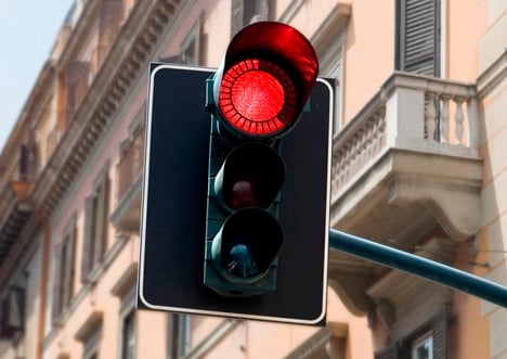
from Yanko Design–a brilliant concept.
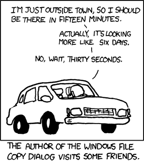
The designers offer a rationale that seeing exactly how long you need to wait for a light will let you know whether it’s worth it to switch off your electric car, but this strikes me as a bit grasping. The real worth behind the concept is the same for progress bars everywhere–they’re tremendously reassuring indicators that the wait is progressing steadily toward an end, and which let you adjust your own expectations immediately toward the perceived completion time. (Thwarting this is what makes Microsoft’s Copy progress bars so frustrating).
In a study I did at Apple years ago, we subjected users to an unexplained delay in the computer’s processing after they hit a “Save” button while doing data entry. Half the users actually concluded that the computer had crashed (getting up from their seats for help or pressing the Reset button) when it didn’t respond in 8.5 seconds. Displaying a watch cursor bought several more seconds, and an animated watch worked even better. But a progress bar* had the users more-or-less-happily waiting for several minutes–exactly the effect you’d need to calm tensions in a cross-town commute.
*A standard (not indefinite) progress bar–we didn’t test indefinite progress bars in this study.
As enthusiastic as I am about the concept, then there’s the part where reality intrudes: The LED technology behind current stop lights makes this physically possible, but although the circuitry needn’t be expensive to make it work, the labor and construction costs involved with replacing or retrofitting existing stop lights–quite possibly running nearly six figures per light(!)–make any sort of broad-based switch-over extremely unlikely in the foreseeable future.


